plot_curve#
- pymc_marketing.plot.plot_curve(curve, non_grid_names, subplot_kwargs=None, sample_kwargs=None, hdi_kwargs=None, axes=None, same_axes=False, colors=None, legend=None, sel_to_string=None)[source]#
Plot HDI with samples of the curve across coords.
- Parameters:
- curve
xr.DataArray Curve to plot
- non_grid_names
str|set[str] The names to exclude from the grid. HDI and samples both have defaults of hdi and chain, draw, respectively
- subplot_kwargs
dict, optional Additional kwargs to while creating the fig and axes
- sample_kwargs
dict, optional Kwargs for the
plot_samples()function- hdi_kwargs
dict, optional Kwargs for the
plot_hdi()function- same_axesbool
If all of the plots are on the same axis
- colors
Iterable[str], optional Colors for the plots
- legendbool, optional
If to include a legend. Defaults to True if same_axes
- sel_to_string
Callable[[Selection],str], optional Function to convert selection to a string. Defaults to “, “.join(f”{key}={value}” for key, value in sel.items())
- curve
- Returns:
tuple[plt.Figure,npt.NDArray[plt.Axes]]Figure and the axes
Examples
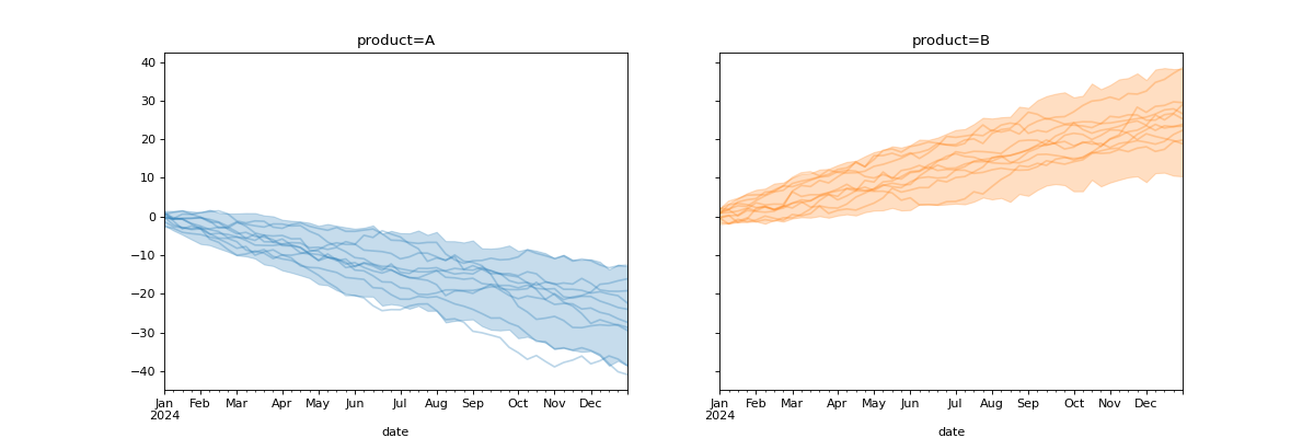
Plot prior for arbitrary Deterministic in PyMC model
import numpy as np
import pandas as pd

import pymc as pm

import matplotlib.pyplot as plt

from pymc_marketing.plot import plot_curve

seed = sum(map(ord, "Arbitrary curve"))
rng = np.random.default_rng(seed)

dates = pd.date_range("2024-01-01", periods=52, freq="W")

coords = {"date": dates, "product": ["A", "B"]}
with pm.Model(coords=coords) as model:
    data = pm.Normal(
        "data",
        mu=[-0.5, 0.5],
        sigma=1,
        dims=("date", "product"),
    )
    cumsum = pm.Deterministic(
        "cumsum",
        data.cumsum(axis=0),
        dims=("date", "product"),
    )
    idata = pm.sample_prior_predictive(random_seed=rng)

curve = idata.prior["cumsum"]

fig, axes = plot_curve(
    curve,
    "date",
    subplot_kwargs={"figsize": (15, 5)},
)
plt.show()
(
Source code,png,hires.png,pdf)
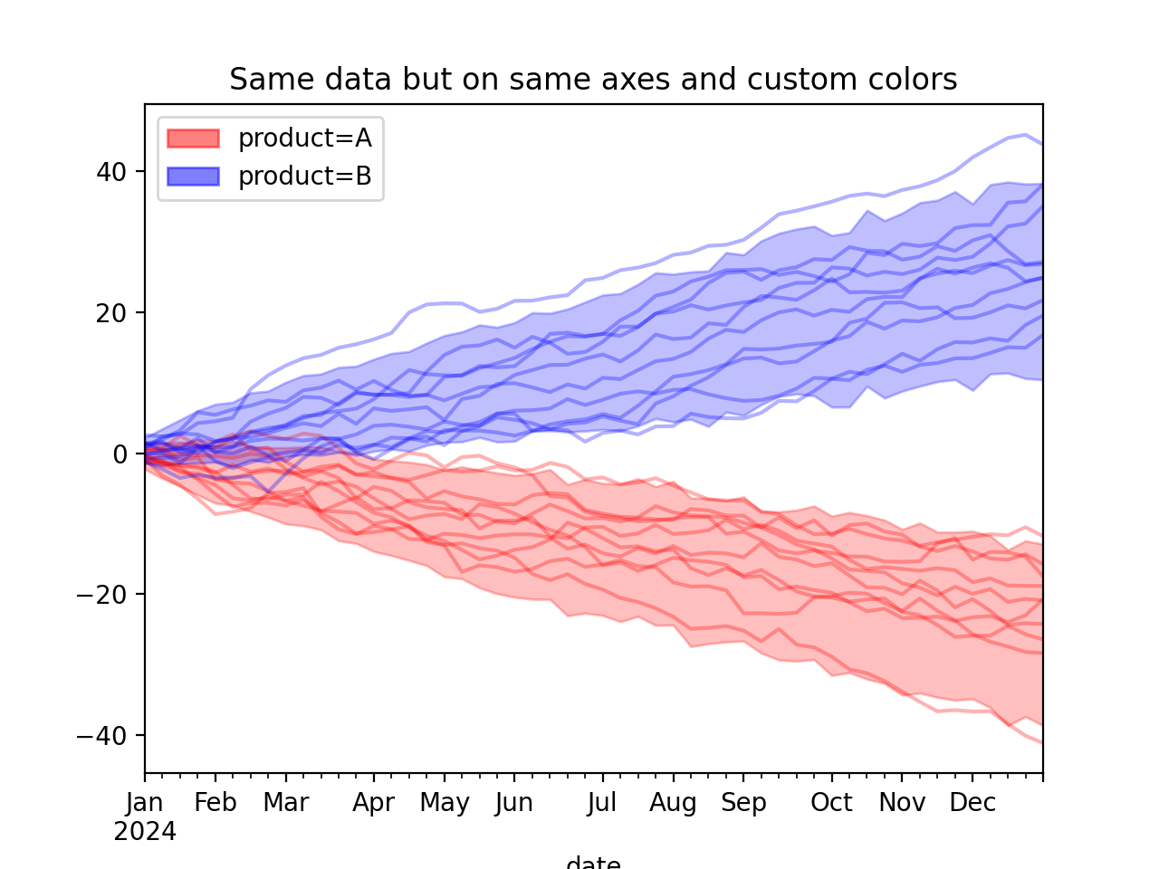
Plot same curve on same axes with custom colors
colors = ["red", "blue"]
fig, axes = plot_curve(
    curve,
    "date",
    same_axes=True,
    colors=colors,
)
axes[0].set(title="Same data but on same axes and custom colors")
plt.show()
(
Source code,png,hires.png,pdf)